After getting requested many times, I spent some time tonight to publish my simple but pretty effective Sass mixin for designing responsive sites with CSS — I call it ReSass.
| ReSass — Sass SCSS Responsive Media Queries Mixin for Eight Different Screen Sizes! 💻📱🖥 |
| A FOSS (Free & Open Source Software) project. Maintained by @AhmadAwais. |

|
⚡️ Introducing ReSass!#
ReSass (ResponsiveSass) creates responsive media queries for seven different screen sizes. These are based on min-width which means if x (x could be 240, 320, 480, 768, 1024, 1140, 1280, or 1500 in pixels) is the size then your CSS will affect any device with screen width x and above.
USAGE:#
CSS content goes inside {} brackets. These mixins should be used inside a class definition.
The following CSS will hide the .header on screen width 320px and above.
⚡️ Getting Started!#
Getting started is very easy.
- Download the raw
resass.scss
- Import the
resass.scss in your main .SCSS file → @import "path/to/resass";
- Now use any or all of the mixins inside a class’ CSS.
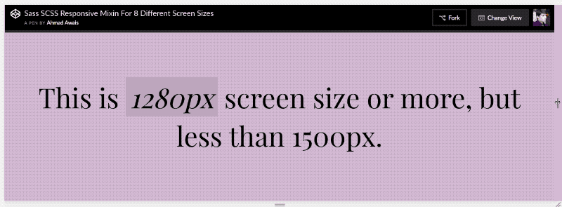
- Here’s a fun implementation at CodePen →
See the Pen Sass SCSS Responsive Mixin For 8 Different Screen Sizes by Ahmad Awais (@ahmadawais) on CodePen.
🌟 Star On GitHub!#
Go ahead and star the ReSass repository at GitHub to show your appreciation and to keep up with the updates.
Awesome developers/designers will
Tweet about ReSass.
Cheers!

 Ahmad Awais

 #
#
Nice. I will definitely be using this. However I have a couple of pointers… Why not throw in Bootstrap media queries to make it compatible at little to no difference? You have 768, why not add 991 and 1200?
If the user doesn’t use bootstrap, no loss. If they do, it works at an advantage.
Secondly why stop at 1500? With the introduction of 4K, 5k and now 8k screens, I would definitely have thrown in a few more there for the larger screens. It just makes it future proof.
Just my thoughts, I’ll be implementing this now. Keep it up.
Off-topic question,
Thank You Ahmed Awais for all the guides and tutorials and contribution to WordPress. It is because of your blog that I have taken keen interest in WordPress development. I currently make websites in WordPress using themes. But I want to really get in to the theme and plugin development. Can you please guide me here shortly, how can I start learning that? Where to start from? What should I learn first?
Thank You
Well, That’s very kind of you to say! 💯
All I can say is look into theme and plugin handbooks. Google the links. Or signup at https://AhmadAwais.com/subscribe/ and read the newsletters I send twice a month. I will announce a course quite pretty soon.
Mentions