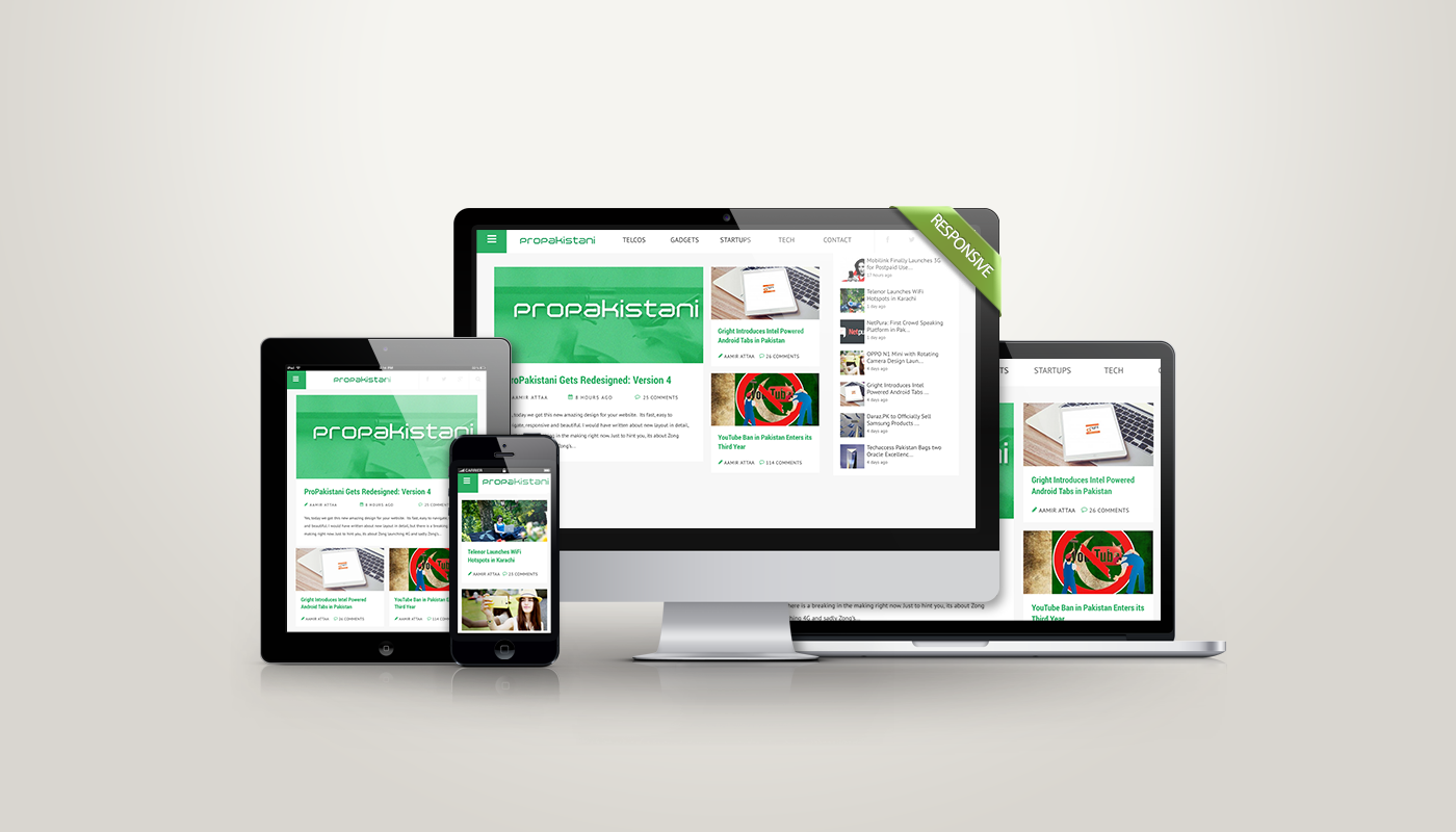
Like many other tech-junkies in Pakistan, ProPakistani.pk has been a permanent fixture in my RSS feeds for many years. I’ve watched them grow from a relatively lowbrow tech blog into a thorough, to the point, actually valuable online telcos resource. Part of that has been seen partly from ‘the inside’, as my team is contributing content here for some time now, and I’m happy to say that my involvement now runs even deeper: I designed & developed the fourth version of ProPakistani.
I applaud ProPakistani.pk because Aamir Attaa and his team had always given their level best when it came to breaking news relevant to telcos niche. Not only this but I believe that ProPakistani has evolved into something much bigger than what it used to be, due to continued improvement; something that is evident when you go and compare the quality of today’s articles with those posted a couple of years ago.
However, for a long time, I had this feeling that ProPK design is holding it back somewhat, nodding back to the days when it was a less well-respected blog in Pakistan. So, when Aamir Attaa asked me if I’d like to redesign the site, I jumped right in at the chance: in my mind, this could be the opportunity for the visuals to more accurately reflect the quality of the content within.
So after multiple sleepless nights, ever-changing deadlines (due to the political situation in Pakistan), me and my team, finally present you all, with the latest re-design of ProPakistani; the fourth as they say.
To define what’s what and how we did everything you see I planned to write about it, about the process as we went through it. Neither I or the ProPakistani team have any plans to ‘crowdsource’ feedback, but this is a rare opportunity, one can get, to talk about some of the decision-makings, and yet I’m a big fan of transparency.
Step # 1: The Pinned Points#
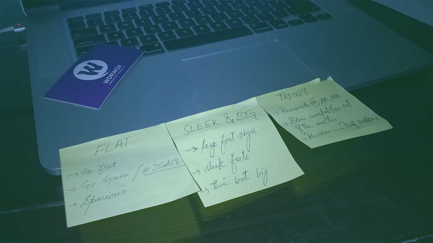
When Aamir Attaa contacted me for a redesign, our team after three meetings pitched a proposal of what we intended to deliver. After individual discussions over Skype one of the three tracks, we pitched, was approved. Then there was a meeting between two designers including me, three developers and a third party designer. Which led us to few key improvement factors: The pinned points
- Flat
- Trendy
- Responsive
- Sleek & the bigger, the better approach
- Pagespeed & more intuitive custom notifications

In the beginning, to form loose ideas of a possible aesthetic, as well as tackle the somewhat complicated issue of ProPK broad categories and how to create a sophisticated responsive design, we started off with the above points.
Step # 2: Design Phase#
The design process began with a lot of research followed by several discussions, and if my recollection of lost isn’t misleading me, then we had 23 meetings. One thing I’d like to mention about my team is, we don’t sit in the form of groups of designers, developers, etc. but we keep on changing our sitting arrangements depending upon the projects we are working over.
To be more clear, let’s say we got the ProPk’s project, the RFP (request for proposal) was addressed, and stuff was finalized. Then in-house we decided about how much time each and everything will take, to who will be working on what. We manage all this stuff over an internal dashboard, where all the set of tasks are created by a particular project lead, who then assigns every task to a particular person. Then at the very end, we get to have the names of all the team members working on a particular project, i.e., ProPakistani. We had two designers and three developers working on this project. So, now whenever these five people are working over ProPK, it is compulsory for them to be seated together. This workflow enhances the performance of team members and reduces a lot of fuss.
Finalizing the Design#
What started with three different designs after a research over 200+ sites ended up in one single workflow within the third week. After that, all we had to do was design what we had in the form of sketches over pages. Took hardly five days and we had a winner. Two quality assurance tests led to the final design pitch which later got approved by Aamir Attaa and his team. It was something like the one below.
Key Design Aesthetics#
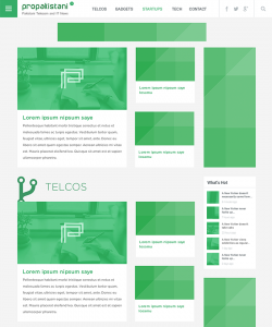
- Introduce lighter green color, #35ad68
- Enhance the major categories
- Thin font with bigger font size
- Half hidden icons ~ the new trend
- New logo with squarish & sleekest look
- Flat and calculated spacing of each element
- 100% span for top navigation bar with social icons
Checkout the live demo of what we deliver LIVE DEMO
Homepage layout ( See the full-size image )

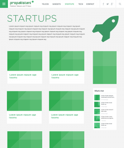
Category Page layout ( See the full-size image )

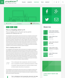
Single post page layout ( See the full-size image )

Step # 3: Development Phase#
Some of the significant challenges in the development phase were tackling with the navigation bar, improving the factor of page speed and a sophisticated responsive design for all the major smartphones, tablets, laptops and desktop computers. We targeted about 18 different devices. Creation of the exact responsive layout was subjected to a good deal of research, I mean look at the homepage. There were 18 different devices which were about to display the homepage seamlessly to keep up with the readability factor and still keeping things following the design aesthetics above.
Responsive Design#
We set to create a truly responsive design for 18 different devices and their latest browsers (The time & budget constraints kick-in here, so, we had to limit the development up to 18 devices). One of the strongest challenges here was Home Page Layout. Development team continually collaborated with a designer to create about four different layouts of Homepage addressing different screen sizes of Smartphones, Tablets, Laptops & PCs.


Reading Is Believing#
To address the readability factor throughout our responsive development phase, we gave more and more space and bigger font sizes.

Sharing Just Got Simpler#
Instead of render-blocking JavaScripts of different social media platforms we decided to build a custom API, which collects and caches the number of shares for each post. Keeping things simple yet making the page speed enhancements added a good deal of value to the user experience.

All Your Favorite Categories in One Place#
Not only is it the latest trend but it helps a lot in UX to have an off-canvas navigation bar.

New Posts in Last 24 Hours#
We thought of implementing at least one feature which was never seen before at ProPakistan.pk, it was a simple but intuitive notification bubble, letting everyone know about the number of posts published in last 24 hours.

Creative 404 Page#
Last but not the least, there is a funny 404 page. When you end up browsing a page at ProPakistani which is no more available, you get to meet our pet made in CSS3

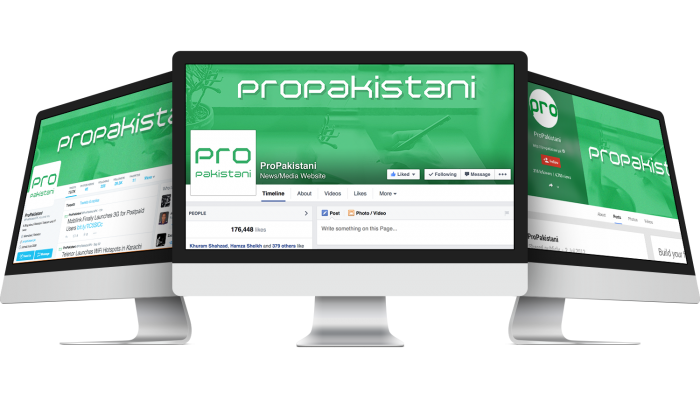
And the Social Profiles Branding#
Every aspect of a brand should follow the same aesthetics and philosophy. We did the rebrand of ProPakistani in a complete 360-degree fashion.

P.S. At the end of the project, ProPK team decided to modify the font from the sleek Gotham Rounded premium family to two different thick fonts and certain other spacing amendments, which my team and I are not accountable for. I still don’t agree with the spacing and fonts they are using, but it is nothing I can control. Kindly check out the LIVE DEMO to judge my design & development skills.
P.P.S. Have any comments? Contact me or Learn More about me Hire Me?

